People are increasingly accessing the web on a mobile device. In fact, now that Google has begun using mobile-friendliness to rank sites, it’s more important than ever to add mobile stylesheets to websites you design. Because the desktop websites are more complex than mobile websites, it makes sense to design for mobile first, and then design for the desktop version.
This article in a nutshell:
This article provides an introduction to coding for mobile websites using a “mobile-first” approach, by using a practical example of a responsive form.Setting Up for Mobile
To make a website mobile, we need to decide where are breakpoints are, design a style sheet for each of those breakpoints, and then use CSS media queries to load the appropriate style sheet.
A breakpoint is simply a width (in pixels) at which a browser will use a different style sheet. There is a great deal of controversy about where you should set breakpoints; for the purpose of simplicity, we’re going to go with a breakpoint of 800 pixels.
Let’s start with the HTML. In our `<head>`, we need to include the following `meta` tag:
<meta name="viewport" content="width=device-width, initial-scale=1">
There are two important parts to that meta tag. The first, `width=device-width` simply tells the browser that the width of our website is equal to the width of the device. (That is, our website responds to the width of the device browser.)
The second part, `initial-scale=1` simply says that 1 CSS pixel is equal to 1 pixel on the device. (Responsive sites should be able to get along without this attribute, but it helps with some devices when switching from landscape to portrait and vice versa. Always test on as many devices as possible.)
Now we need some style sheets. We’ll link our two stylesheets in the `<head>` element, and this is where we’ll use those CSS media queries:
<link rel="stylesheet" media="screen and (min-width: 801px)" href="styles.css" />
<link rel="stylesheet" media="screen and (max-width: 800px)" href="mobile.css" />
If you are accustomed to creating print style sheets, you’ve written things like `media=”screen”` and `media=”print”` before. But now we’re telling the browser to look at the size of the device and load the appropriate style sheet:
- If the device is at least 801 pixels wide, the browser will load `styles.css`.
- If the device is 800 pixels or fewer wide, the browser will load `mobile.css`.
Mobile First…
Typically, forms on a web page look like this:
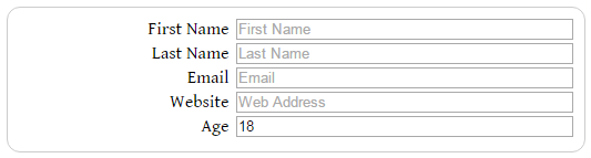
With labels on the left and inputs on the right. This harkens back to the days when we used tables for such layouts. It works, because each individual item is on its own line. It’s almost impossible to confuse items.
On a mobile device, however, width is at a premium, so forms typically look something like this:
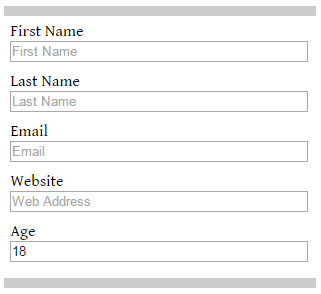
with labels above the inputs, and a bit of space in between to keep things neat.
(In both cases, I’ve included a border around the form. I will sometimes do that if the form gets lost in the rest of the page, but typically, a form is the major element on a page. I use them here so the screenshots look clear.)
The HTML for the form is simple:
<form>

	<label for="firstname">First Name</label>
	<input type="text" id="firstname" placeholder="First Name" autofocus>

	<label for="lastname">Last Name</label>
	<input type="text" id="lastname" placeholder="Last Name">

	<label for="email">Email</label>
	<input type="email" id="email" placeholder="Email">

	<label for="url">Website</label>
	<input type="url" id="url" placeholder="Web Address">

	<label for"age">Age</label>
	<input type="number" id="age" min="13" max="100" step="1" value="18">

<div class="clear"></div>

</form>
This isn’t a real form, so there’s no `action` on the `form` element itself, nor is there a submit button.
You can see that we’re only dealing with three elements here. Our CSS will be equally simple.
Let’s deal with the form first. We’ll add a border on the top and bottom, and a bit of padding to each side:
form {
	border-top: solid 10px #ccc;
	border-bottom: solid 10px #ccc;
	padding: 2%;
	margin: 0;
	width: 96%;
}
That padding is important, because with some devices, the edge of an input box will disappear into the edge of the display, making it appear as if something is missing. Forms on paper always have a blank margin around the edges, so our eyes are accustomed to seeing a little white space around the form.
I’ve also set the margin to 0, because I want the top and bottom borders to extend a bit beyond the side of the form. If you want them to line up with the other form elements, you can swap out these values. Just because it’s mobile doesn’t mean we don’t have to consider the aesthetics of a site; it’s just that there are fewer items to consider.
I have also set the form’s width to 96%, because I want the form to take up the entire width of the browser window, except for that bit of padding. (Remember how the CSS box model works? It still applies, even in mobile designs.)
The `<label>` and `<input>` elements are simple and almost identical:
label {
	width: 98%;
}
input {
	width: 98%;
	margin-bottom: 10px;
}
I’ve set both their width’s to 98% because the agent style sheet (the default style sheet built into a browser) will sometimes collapse the border around that input box, and sometimes it won’t. On a desktop, it doesn’t matter if I use 98% or 100%, but I don’t want to risk my mobile users having a scroll bar show up at the bottom of the page. (Again, test in as many devices as possible, but also take precautions against devices you can’t test in.)
I’ve also added a margin to the bottom of the `<input>` elements, to separate each item in the form from the others.
…Then Desktop
The desktop style sheet is going to be a bit more complicated. Let’s look at the `form` styling first:
form {
	border: solid 1px #ccc;
	border-radius: 12px;
	padding: 10px;
	margin: 10px auto;
	width: 500px;
}
Nothing surprising here. I’ve set a width, padding, and margin values, and also added a border. (And with a nod to the days when CSS3 things were new and exciting, a border-radius.)
The label and input elements get a bit more complex, because we need to use floats. Here’s the CSS for the labels:
label {
	float: left;
	text-align: right;
	width: 190px;
	clear: both;
}
I’m setting this element to float to the left, but align the text to the right. I’m also clearing the floats on any elements that come before this, so that each label/input pair will appear on their own line.
Speaking of which, here’s the CSS for the inputs:
input {
	float: right;
	text-align: left;
	width: 300px;
	margin-bottom: 3px;
}
They have almost the exact opposite alignment as the labels: they float to the right, but align to the left. And again, a margin of 3 pixels on the bottom just to keep each label/input pair separate from the others.
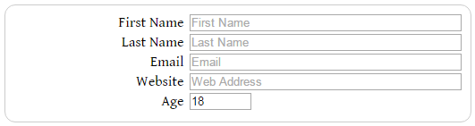
This is just a quick and simple demonstration of designing for mobile first, and then adapting it to desktop. In reality, I would set up even more CSS rules for my `<input>` elements on the desktop, since I don’t want all my inputs to be 300 pixels wide. For example, for the “Age” input, I could include a line of CSS like this:
input[type=number] {
	width: 65px;
	float: left;
	margin-left: 6px;
}
to give me something like this:
A final word of advice…
It is tempting to design for a particular mobile device. Unless you are designing an app that will only be used on a certain device, this is always a bad idea. Design for a given breakpoint, based on the layout of your page. And now that you know what breakpoints are, you can start to look for them where they naturally occur in the pages you are designing now.
Additionally, because I limited my media queries in this tutorial to size, I didn’t need to upload these files to a server and view them in a mobile device to get the screencaps. All I had to do was resize my browser window.
Conclusion
If you have never designed for mobile before, and have no idea where to start, this brief tutorial should set you firmly on the road. Fire up your text editor, and get going.
If you’d like, you can download the template files I created for this tutorial from GitHub.
https://techblog.kjodle.net/2015/10/20/creating-responsive-forms-an-introduction-to-mobile-design/
