In my earlier post about using Graphene action hook widgets, I neglected to mention how to target each widget in the style sheet. In much the way that WordPress gives each widget its own unique ID, which you can then target with some specific CSS, Graphene also provides each of these action hook widget areas with a unique, non-numerical ID, which you can then target in your style sheet. This is fairly easy to do if you use Firebug. (My own tutorial is here, and Josh’s much better video tutorial is here.)
Here’s a recent example. On the Graphene support forum, somebody wanted to know how to create three or four widget areas right under the main navigation menu. My suggestion was to use an action hook widget area and then style it with some custom CSS. This is actually a fairly simple process, so I’m going to take this opportunity to also show how to add CSS declarations and tweak them to suit your needs. If you know very little about CSS, this should be of some use to you, even if you are not using Graphene’s action hook widget areas.
Contents
Creating the Widget Area and Adding Text Widgets
I went over to my test blog to try this out. (This is basically a sandbox area where I can play around with things without messing up any of my production blogs. If you have the space to do this, I highly recommend it.) Following the steps in my earlier post, I created an action hook widget area by ticking the box labeled `] in the header.php file:
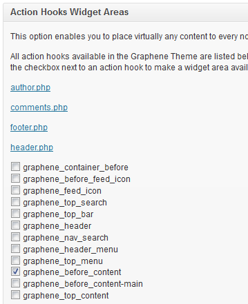
I then went to the widgets pane and dragged three text widgets into that widget area:
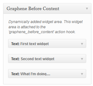
and just filled them in with some placeholder text so I had something to work with.
That work gave me something that looked like this:
which doesn’t even begin to impress. You can just barely see the text I entered in the text widgets (although you can see the one link—”this”—that I entered in the third text widget). It looks just like a big gap in the middle of my page—which is exactly what it is.
Identifying the Class and ID Attributes
Time to get out the Firebug. Inspecting this area with Firebug shows us this:
As you can see, the action hook widget area that I created has both a unique ID (`graphene-dynamic-widget-graphene_before_content`) and a class (`graphene-dynamic-widget`). If I target the class, I can style all the action hook widget areas at once. What I want to do, however, is to target just that new widget area. So I’ll go to the custom CSS option of Graphene and start by naming the ID of that widget, along with an opening brace:
#graphene-dynamic-widget-graphene_before_content {
and then I’ll add a background color. `#e3e3e3` is the default Graphene background color for this area, so I’ll use that:
#graphene-dynamic-widget-graphene_before_content {
 background: #e3e3e3;
 }
I also added a closing brace. That makes everything look like this:
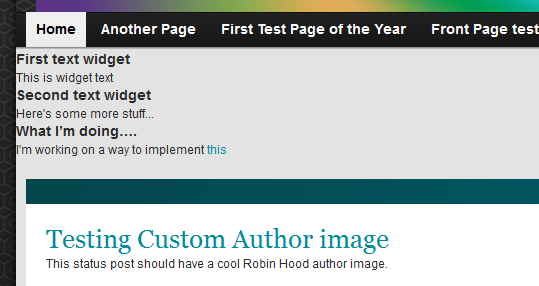
It’s not perfect, but at least you can see what I’ve written in each text widget. What we need to do now is to style those widgets.
Style the Text Widgets
I could do what I’ve done in that previous tutorial and target each one by their unique ID, like this:
#text-8 {style elements;}
#text-9 {style elements;}
#text-10 {style elements;}
replacing “style elements” with actual style declarations, which is what I would need to do if I wanted each of them to look different to one another. However, these are all going in the same area and I would like them to look uniform. Fortunately, WordPress gives each text widget, in addition to its unique ID, a unique text widget class, `.widget-text` which you can see in the Firefox screen shot. If I target this class though, my style declaration will apply to all text widgets, not just the three in this widget area. The way to target just these three widgets is to first declare the widget area ID, followed by the widget class, like this:
#graphene-dynamic-widget-graphene_before_content .widget_text {
    style elements;
}
This tells a browser is to apply any of those style elements I declare here only to these text widgets in this particular widget area.
Line up the Text Widgets
The first issue I need to deal with is that these text widgets are stacked one on top of the other, and I would like them to be in a single row. So I add some positioning information:
#graphene-dynamic-widget-graphene_before_content .widget_text {
    position: relative;
    float: left;
}
which gives us this:
Adjust the Width and Add a Border
What I need to do now is to make each one have the same width and add a border:
#graphene-dynamic-widget-graphene_before_content .widget_text {
    position: relative;
    float: left;
    width: 28%;
    border: solid 3px #0000ff;
}
Which gives me this:
That looks a bit scrunched, but a bit of padding and margin will take care of that:
#graphene-dynamic-widget-graphene_before_content .widget_text {
    position: relative;
    float: left;
    width: 28%;
    border: solid 3px #0000ff;
    padding: 10px;
    margin: 10px;
}
Understanding Margin and Padding
Some people are confused as to the difference between padding and margin. The difference is this: `padding` adds space between the contents of a block and the border that goes around it, while `margin` adds space outside the border.
Both will add to the overall width of a block, by the way, so if you specify that a block has a width of 300 pixels, and then add 10px of margin, 10px of padding, and a 5-pixel wide border, the actual width will be 350 pixels: 10 px of left margin, 5 px of left border, 10 px of left padding, 300 px of block, 10 px of right padding, 5 px of right border, and 10 px of right margin.
10 + 5 + 10 + 300 + 10 + 5 + 10 = 350.
You may have wondered why I set the width of these text widgets to 28%, instead of 33%. I knew I would add a border, and I knew I would need padding (to separate the text from the border) and margin (to separate the text widgets from each other), so I deliberately erred on the small side. I can always adjust that width later.
Now I have this, which I like:
Round Off the Corners
Let’s add some rounded corners. Now our custom CSS looks like this:
#graphene-dynamic-widget-graphene_before_content .widget_text {
    position: relative;
    float: left;
    width: 28%;
    border: solid 3px #0000ff;
    padding: 10px;
    margin: 10px;
    border-radius: 10px;
}
and our page looks like this:
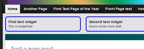
Adjust the Position of the Action Hook Widget Area
There’s just one last issue to deal with: these widgets aren’t centered. What you can’t see in the above image is that right side has more space than the left:

There are five ways I could handle this:
- Increase the width of each text widget.
- Increase the padding in each text widget.
- Increase the margin in each text widget.
- Since I know the exact width of the larger container, I could specify my text widget width in pixels, instead of percentages, and use an exact number.
- Apply a negative margin to the right side of the Graphene action hook widget area.
All of these are perfectly legitimate ways of dealing with this issue, and all involve a bit of trial and error, except for the fourth way, which involves math. However, let’s use the unconventional way, which is to add a negative margin to the right-hand side of the Graphene action hook widget area. Not many people know that you can use negative values for the margin (which is one way to create a hanging indent), so I like this method. (`padding`, on the other hand, will accept only positive values.)
Now our overall code looks like this:
#graphene-dynamic-widget-graphene_before_content {
    background: #e3e3e3;
    margin-right: -25px;
}

#graphene-dynamic-widget-graphene_before_content .widget_text {
    position: relative;
    float: left;
    width: 28%;
    border: solid 3px #0000ff;
    padding: 10px;
    margin: 10px;
    border-radius: 10px;
}
Which makes my page look like this:
If you have a question or comment, or an even better way to handle this, feel free to drop a comment below.
https://techblog.kjodle.net/2012/04/14/target-graphene-action-hook-widgets-by-their-unique-id/


