In the first part of this tutorial, I showed you how to insert both pictures and code into a text widget in WordPress. This time around, we’ll see how to format those types of text widgets.
Contents
Styling Text Widgets With a <div>
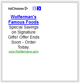
Most WordPress themes include a number of sidebar areas, where you can include something like Google Adsense code. The problem there is that Google exercises very strict control over the size of these ads, and few themes precisely match their sidebar to Google ads. There are just too many different bits of code that can be dropped into a text widget to accommodate them all. So if your widget area is wider than the ads, everything gets left-aligned:

The quickest and easiest way to fix this is to wrap that code in a `<div>` and apply a style that will center its contents. The complete code looks like this:
<div style="text-align:center;">
<script type="text/javascript"><!--
google_ad_client = "ca-pub-2129785167572418";
/* main site */
google_ad_slot = "6412291820";
google_ad_width = 120;
google_ad_height = 240;
//-->
</script>
<script type="text/javascript"
src="http://pagead2.googlesyndication.com/pagead/show_ads.js">
</script>
</div>
And the final product looks like this:

That looks a lot better, although there is a lot of white space there. Let’s look at a different way to style text widgets that provides a lot more control over their appearance.
Styling Text Widgets by Targeting their ID
The great thing about using WordPress is that it gives every element on a page a unique ID, which means that you can target those elements in your CSS by their ID.
First, you need to figure out an element’s unique ID. There are two ways to do this, one kind of easy and one really easy.
The kind-of-easy way to use your browser’s “View Source” function and then scroll through all that code in order to find it. It helps to enter a unique phrase in the text widget and then search through the source code to find it. As an example, I entered “awesomewidgettext” into a text widget and found this in the source code:
<div id="text-7" class="sidebar-wrap clearfix widget_text">
<div class="textwidget">awesomewidgettext
</div>
</div>
I’m using the Graphene theme; your theme may set up text widgets differently.
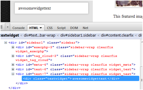
The other, even easier way, is to use Firebug. If you are trying to style your blog and not using Firebug, you really need to. A brief tutorial is here. Using Firebug, we get essentially the same information, only without all the searching:

No matter which method you use, the important part is `id=”text-7″`. Using that information, I can now target that widget with specific styling information in my style sheet, like this:
#text-7 {
    text-align: center;
    background:blue;
}
Now you can see that the widget has a blue background:

Using this technique, I can apply a number of different styling options all at once to the same text widget. For example this code:
#text-7 {
    text-align: center;
    background:#fff;
    -webkit-box-shadow: 0 0 10px #1866af;
    box-shadow: 0 0 10px #1866af;
    -moz-border-radius: 30px 30px 30px 30px;
    -webkit-border-radius: 30px 30px 30px 30px;
    border-radius: 30px 30px 30px 30px;
}
gives it this appearance:

I could go on with more examples, but I think you get the idea.
Text Widget Size vs. Adsense Size
Of course, using this method, you can also adjust the width of a text widget with some fairly simply CSS. One problem I often see people struggle with is when Google Ads are too wide for a particular widget area. Their natural inclination is to ask “how do I make this text widget wider to contain the entire ad?” This is usually because of a situation like this:
See how the ads burst out of the widget area? They actually slide under the post and over the “About the Author” area. Unfortunately, making this widget area wider won’t really help, because the different areas on a blog for sidebars and content are placed using the “float” property, so they won’t nudge the other content out of the way.
As I said earlier, Google exercises a great deal of control over their ad sizes, because Google charges advertisers for that ad space, and it’s legally obligated to make sure those advertisers get the ad space they pay for. Despite what you try, the only way to change an ad size is to go back to your Google Adsense account and get code for a different size ad. I haven’t worked with every ad server in the world, but they are under similar obligations. Your best bet is to use a widget area that’s a little bigger than the ads you are trying to serve, or to use an ad size that is slightly smaller than the location than the area you would like to serve ads in.
Of course, you can always fill that white space with a picture that matches the rest of your theme:

If you have questions, feel free to comment.
https://techblog.kjodle.net/2011/12/05/fun-with-text-widgets-part-two/


Great post. I love what U did with this site and Graphene theme.
Thanks. The appearance is the result of lots of hours of trial and error. It helps, of course, to start out with such a flexible theme.
Very useful posts,
but I still have problems with resizing script into a text widget.
that is the script I want to use (scores from some kind of sport portal):
Can I resize “the scores” to fit into a text widget properly?
Thanks for your help