I have the RSS feeds of several hundred blogs and websites bookmarked*. These are everything from the personal blogs of friends and strangers to the BBC. I don’t read every article on every site (although there are a handful that I do), but I check the feeds on a regular basis and when I spot an article with an interesting or enticing title, I definitely read it.
Needless to say, I was quite excited when I saw a guest post on Blacksburg Belle’s blog called “10 Things About Your Site That Will Make Me Cringe.” Between my activities on various forums as well as researching and writing about all the things that interest me personally and professionally, I see a lot of websites. Most of them are fairly well-designed, although there are often a few things here or there that bug me. I also see sites that are clearly a work in progress: while the design is far from optimal, it’s clear that they are working on the design and making improvements. And every once in a while, I see a design that is just plain awkward, making me wonder if it was designed by a committee or a person with color blindness.
Update Information:
Well, that page didn’t last forever. But you can see it on the Internet Archive here.This is a topic I’ve wanted to talk about for some time, because it’s taken me a long time to learn how to design web sites that are visually attractive and yet functional and easy to navigate. Notice that I call these “guidelines” rather than “rules”. What I find attractive is a matter of personal preference. What I find useful is also a matter of personal preference, but is also a matter of ability and knowledge. We all want to design websites that people will come back to over and over again, however, so we need to design websites that are attractive and useful to a wide range of tastes and ability and knowledge levels. What I offer here, therefore, are some general guidelines, based on my research and experience. You are always free to comment, of course.
Like I said, these are guidelines, not rules, although both guidelines and rules have exceptions. If your website violates one of these guidelines, don’t get all bent out of shape. To quote from Emily Thompson, the guest author of the post called “10 Things About Your Site That Will Make Me Cringe“:
This is a list of my own annoyances and opinions. It does not mean that if you use them then your site is evil. It just might make me cringe a bit.
I point this out because I am apparently gifted at annoying the easily annoyed. Also note that when I say “in my opinion” (or the equivalent), I actually mean “in the opinion of myself, my friends and colleagues,” although since I don’t mention those friends and colleagues by name here, I’ll take all the lumps you hand out when you get your knickers in a twist over something I’ve said.
A lot of this advice is about respecting your readers and their needs. If you take into account your readers’ needs, you will have plenty of readers in time. Yes, I know it’s your blog or website, and yes, you can do whatever you like with it. But if you do something which hurts my eyes, my ears, or my brain, you can hardly blame me for not coming back.
*“Several hundred” is not an exaggeration. This is the miracle of RSS. To get a very poor tutorial on how you, too, can use RSS to follow dozens or more blogs and/or websites, read this.
Contents
Design Elements to Avoid
Splash Pages
A splash page is a page with no useful content that readers encounter when they go to your URL. They often contain some sort of Flash animation that may be interesting to watch the first time you see it, but which quickly becomes both boring and an impediment to your readers.
I have seen a lot of arguments in favor of splash pages (from splash page designers, presumably), saying that a well-made splash page doesn’t have a negative impact on your website. Of course, they can never point me to a well-made splash page, and besides, just because something “doesn’t have a negative impact” doesn’t automatically mean that it has a positive impact.
Think about it. You want readers to come to your site so that you can provide them with information or to sell them something, or both. So why would you put a fence up between your readers and what they are coming to your site for?
Imagine if splash pages existed in the real world. You just want to go in and buy a few groceries, but you have to stand at the door of the supermarket and spend thirty to sixty seconds watching an animated bit that has nothing to do with your intense desire for cheese. You go to an auto dealership to buy a car and must first watch a two-minute animated car zooming around an impressionistic landscape. The car isn’t real, the landscape isn’t real, and yet no car salesman will talk to you until you finish watching it. You go to a restaurant and before being seated must watch a 90-second clip of an animated salad dancing across the screen. This is before you get a menu or a glass of water, mind you.
If this were the case, you wouldn’t go back to those businesses, would you? If you do that with your website, I probably won’t be going back to it. Life is short and I have better things to do with those 90 seconds, believe me.
If you don’t believe me, take a look at the website for In-N-Out Burger, which has a flashy (and cheesy) splash page. Is there anything about that splash page that makes you want to jump in your car and drive over there right this moment for a lump of pre-chewed bovine carcass? I didn’t think so.
[important]Update 2014.08.15:
In-N-Out Burger obviously got the hint, because they no longer have an atrocious splash page. Their page is still ugly (mainly because their buttons are blurry), but at least I don’t have to wait thirty or sixty seconds to see it. I can get to the ugly immediately.[/important]
Animations
If your goal is to show off the animations you have created, then feel free to add as many animations as you would like to your site—hopefully only one per page, unless you are asking us to compare and contrast two or more animations. If, however, you would like us to focus on your text or your photos or anything that isn’t an animation, don’t include them.
I know you think they’re cute and if you really can’t live without them, then put them somewhere on your site away from your main content where the rest of can live without them. Multiple animations are a hallmark of websites created by 12-year-olds.
Music and Sounds that Play Automatically
These are annoying. I usually have several tabs open at once, and because some sites rotate their ads on a continuous basis, every once in a while one of them will start screaming at me because they are now displaying a video ad. I then have to find which page is displaying that ad and close that tab. Other websites will have music playing more or less continuously, with a different song on every page. Click on a different page and suddenly you’re listening to a different song. Yet others will include a very long audio clip that loads on the front page.
It’s an issue of control. I have no way to turn off these sounds, other than muting my computer, and since I often listen to music while I work on the computer, that’s not a valid option for me.
If you really need to include audio (because you’re a voice-over actor, or a band, or something else where sound is your product), then use an embedded audio player, so that your readers can turn those sounds on and off. You don’t walk into an audition reciting Macbeth at the top of your voice; you wait until the casting director tells you to start reciting lines. Why would you do this on the internet?
If you don’t believe me, just take a look at the In-N-Out Burger website again.
Ads in the Middle of Your Content (and Everywhere Else)
I don’t mind ads on a website; I have several of them myself. I’m not even close to paying for my hosting fees with the revenue from them, but the revenue trickles in, and I’m extremely grateful for those funds. Although my memory is long enough to remember the internet before ads (and spam), my complaint is not with ads in general.
What bothers me are ads that interrupt the flow of the content, and therefore interrupt my train of thought. Presumably, you’ve taken time to create interesting, useful content (you have, haven’t you?), so why do you want to turn all that hard work into a less than optimal experience for your readers? I especially object to ads that get between the post title and the main content, or that are inserted randomly into the content. I especially object to ads that try very hard to not look like ads. This is simply deceptive, and if you want to sink so low, I’m not going to follow you into the gutter. Plenty of other websites out there, after all.
Too Many Social Sharing Buttons
If you look at this blog, I have social sharing buttons at the top and bottom of each post or page, along with a set that permanently sits on the upper right hand side. I want my readers to share items that they find useful or interesting, so I place these here for their convenience. What I don’t like to see is when I go to a website and see one set of thirty or forty social sharing buttons. You simply can’t be all things to all people; having that many different social sharing buttons suggests that you don’t know who your audience is or would like them to be.
Even worse is when I see three different buttons to share a page on Facebook. Let’s face it, if I want to share one of your posts with my friends on Facebook, I’ll figure out a way to do that. If I don’t want to share one of your posts, then your having three or four different Facebook links isn’t going to change my mind.
A good alternative is to use sharing code from Addthis.com or Sharethis.com. You can select an odd number of buttons (odd numbers are generally more aesthetically pleasing than even numbers), and then your readers can customize which sharing options they would like to appear there. It’s the best of both worlds. (If you would like to try this, then click on the red sharing button with a white plus sign (looks like the Swiss flag) and then click on “Settings” in the bottom of the window that pops up.
Articles Broken Across Several Pages
A long time ago, articles that are a list of items—articles like this one, in other words—used to appear all on one page. It was easy to read, easy to print out, easy to bookmark. Now such articles are often often broken up into any number of pages. This is a real pain in the backside if you want to read them, and an even worse one if you want to print them out or save them as PDF files to read later. So keep all your articles on one page, please.
The reason people do this is simple: advertising. Whether you make money from ads on CPC (cost per click) basis or a CPM (cost per thousand impressions) basis, you have been advised to break these articles up to get as many pages as possible, in order to get as many ads out there as possible. This is yet one more way that money has really screwed up the web. You might want to read this post by Glen Engel-Cox if you are interested.
Underling that Isn’t a Link
You may be new to the web, but many of your readers aren’t. Traditionally, links are underlined. If you include underlining on ordinary text, people may try to click on it, thinking it will take them someplace interesting. At best they will be mildly annoyed and frustrated, and at worst they will think you know as little about [insert focus of your website here] as you do about creating a web page and go someplace else.
Besides, underlining is for typewriters. I get annoyed when I see it in the text of a word-processed document. If you want to emphasize something, then use italics or bold. Too much underlining makes your website look like it was designed by a seventh-grader who’s off his Ritalin.
There is a place for underlining, however. Used with headers (along with a careful application of whitespace), it can help break dense chunks of text into much more readable sections.
“Under Construction” Banners
In the days when it first became possible for an average person to publish on the web, web sites were considered to be like books: something to be written, edited (often carelessly), and then published permanently, never to be touched again. Web pages that weren’t quite finished were then labeled with “under construction” banners meant to inform readers that the page wasn’t completed yet.
Now that every business, organization, and individual has their own website, how we view websites has evolved. We no longer view them as something that is published once and then never edited again; rather, we view them as dynamic projects, with new content being added, old or outdated content being deleted, and current content being constantly revised. Because we now expect websites to be ever-evolving projects, there is no need to label them as “under contruction.” All good websites are constantly under construction.
In fact, the only website that I dislike or distrust more than one plastered with “under construction” banners is one which never changes—ever. Because I expect pages to change, you don’t need to alert me that they are going to do just that.
Clock Plugins
There are lots and lots of these to choose from, and they have so many features and designs, and it’s just the tiniest bit of code to install. Why not include one?
The reason is simple: nobody needs it. If I want to know what time it is, I can simply look at my menu bar (Mac) or tool bar (Windoze), or my mobile phone, or my watch, or the clock on the wall. Most of them don’t work as expected anyway: I’ve seen clocks that are supposed to display my local time but display the server time (which is often several time zones away), or which are supposed to show GMT or Toronto time or Vancouver time, but inevitably end up showing my local time. (Is it just me, or are these things completely counterproductive?)
I admit, I used to have one on my book blog, labeled “Time to Read!”. I was quite happy with it for a long time, but like short trousers, I eventually outgrew it, because I realized that it served no purpose. Bells and whistles are nice if there is plenty of solid content behind them, but once you have plenty of solid content, you realize that people are coming to your website for the content and not the bells and whistles. So get rid of the bells and whistles, no matter how cute you think they are. Murder your darlings, murder your darlings.
Design Elements to Include
Quality Photographs and Graphics
I am not a big fan of including photographs and images just so that you have photographs and images on your web pages. I like to read and I don’t mind big long articles even if they don’t have any images to accompany them.*
Still, there are plenty of people who believe that their readers have limited time and limited attention spans, and therefore prefer short articles with lots of pictures. I’m not going to argue about the length of articles (I’m probably losing the war on that one anyway), but I do think that a relevant photograph or image doesn’t hurt. Just make sure that it’s a quality photograph (preferably one you’ve taken yourself), and doesn’t have the watermark of an online image broker stamped all over it.
If you do include more than one image, make sure that they all share something in common, whether it’s content, format, or color. There’s nothing more annoying than seeing a bunch of images that have nothing in common with each other and were apparently just grabbed off Google images by the author’s ten-year-old child. The images on a post should work together to create a sense of harmony, not a sense of discordancy.
Still, if you must choose between poor photographs and no photographs, err on the side of caution and choose no photographs.
*This makes me a grouchy, curmudgeonly exception on the web. So be it. The generally expected rule is short articles comprised of short sentences comprised of short words, accompanied by lots of bright and shiny pictures. Don’t sink so low. Please expect more of your audience. If you are an artist or photographer, then of course I expect lots of images. If you are a writer, then I don’t expect to see any. If you are anyone else, then one or two images is fine. Please challenge my expectations, before my expectations challenge me.
A Search Function
I rarely use a site’s search function; generally when I go somewhere, I’m following a link from another website or from an RSS feed. But when I end up on a site, perhaps trying to find a page I know is there but forgot to bookmark, a search function is not just a useful option, but an absolute necessity.
Most blogging software and blog themes include a search function. If you are coding by hand, or your platform doesn’t provide a search function, you can easily add a Google search bar to your site by signing up for Google Adsense.
A Useful 404 Page
Visitors don’t always type in the right URL, search engines sometimes index the wrong page, and people sometimes type an address wrong when linking to your page. You really need a useful 404 page that lets readers know they’ve arrived at some place that doesn’t exist, and gives them options for finding the page they were looking for, either through a search box or a site map.
I could say more about this, but there is a good page on creating a useful 404 page over at webweaver.nu.
Design Elements to Get Right
Have a Coherent Style Across Pages
I once worked for a small organization that had just under twenty separate pages on their website. Although the pages shared the same color scheme and page layout (header on top, two sidebars on either side of the main content area), the menu on each page was in a different location, as was the background and borders. Some sidebars had curved corners, others had straight. Bullets were used on some lists and greater than signs on others.
Your website needs to have a coherent appearance from page to page. This is one of the advantages of using CSS, and one of the best advantages of using a CMS (content management system) like WordPress or GetSimple. If there is a section of your website that really does need a different appearance (a store front, for example), then you are better off putting it in a subdomain.
Make Sure Your Links Look like Links
There’s nothing more annoying than surfing a website and not being able to tell what’s a clickable link and what’s not. Traditionally, links are underlined, and there’s nothing wrong with observing that. If, however, you don’t want underlined links for aesthetic reasons, make sure that links appear in a different font weight or color—something, anything, that tells readers that those bits of text are not ordinary bits of text.
If you really want to see what is possible with a bit of basic CSS, then check out the links on Kremalicious (all the links) or Prove Me Wrong (the previous post and next post links above the main post).
Use Appropriate Titles
Writing good titles is both an art and a skill. There is not a writer alive who hasn’t had at least one title not just tweaked but completely changed by an editor. Since you don’t have an editor looking over your shoulder, it’s in your (and your readers’) best interest to write arresting, yet informative titles. If you can’t come up with something that is arresting and informative, err on the side of informative.
In general, avoid using the word “you” in a title, which just adds a lot of useless bulk to your title. Compare
How You Can Increase Your Readership by 50%
with
How To Increase Your Readership by 50%
with
Increase Your Readership by 50%
Less is definitely more, isn’t it? Notice that we took this from showing someone how they can do it, to showing them how to do it, to just telling them to do it.
Yes, I have violated this rule numerous times on this blog, such as with my article “How to Create and Use Custom Menus in WordPress“, which I should have called “Creating and Using Custom Menus in WordPress” or even just “Custom Menus in WordPress”. (I got it right on most of my other tutorials, however.) That happened because I saved it as a draft and then published it without editing the URL. Now that it’s been mentioned on other sites, I can’t go back and edit the URL without breaking those links. Likewise, I could change the title, but don’t because I don’t want readers to land on my blog looking for one title and finding something else.
Is there an exception to this guideline? Of course there is, right here on this blog. My WordPress and Graphene tutorials have very functional names, as do my podcasts. But for personal blog posts, I use some pretty odd titles: …i will be collating all weekend long… and you are now free to wander about the cabin…. These posts convey some pretty personal information and are pretty much just me having fun—in some ways they are the equivalent of musical improvisation—so I don’t want anyone to think they contain information that they simply must have to survive life in these United States without corporate sponsorship. Hmm…..that sounds like a good title for another blog post.
Text
There are two common issues regarding text that you should avoid: light-colored text on a light background, and centered text. Unfortunately, I see these all the time.
Let’s deal with color first. The main issue on the web, or indeed anywhere, is readability. Can your readers read what you have published? If you’ve used a yellow font on a light-colored background, they probably can’t. You see what I mean? You need a certain amount of contrast for text to be read easily.
On the other hand, you can sometimes have too much contrast. The default for most platforms and and blog themes is black text on a white background. If that’s too much (and without anti-aliasing, it may be), then a better option is dark grey on a white background or black on a very light grey (or blue) background.
So what about that centered text?
There is only one thing you should center and that’s the title of your page, and even that is questionable. I don’t know why some people will insist on centering all the text on their website—maybe they think it’s all arty and creative. There is more to being artistic and creative than just centering text, however. Show me any blog post with centered text, any poem that is centered all the way through, and I will show you generalized appeals to emotions along with painfully clichéd metaphors and similes. Centering text doesn’t make you a poet any more than sitting in the garage makes you a car.
Is there any exception, though? There are always exceptions: check out how the Perry Bible Fellowship lays out their pages.*
If you are worried about readability, then you need to know that the easiest text to read is that which is left-justified with a ragged right edge. (This applies to print as well as to the web.) Fully justified text can be difficult to read as well, especially on the web. Different browsers handle full-justified text differently, so even if you can get it looking good on your computer, it may be a less than optimal experience for many of your readers. As this post from the Web Style Guide points out, no browser can yet offer automatic hyphenation, a requirement for true full justification.
*Are you good enough or unique enough** to be the exception, though? Probably not. So don’t center text. I’m not good enough either, though. I just don’t let it keep me up at night.
**I generally object to anyone who qualifies the word “unique” since it means “one of a kind.” You simply can’t be “very one of a kind” or “more one of a kind”, can you? This seems to be the exception to the rule, however. I suppose you could say “different enough” instead of “unique enough” and I would be happy with that, but it doesn’t convey the distinction that “unique enough” does. So be it.
Width
If you have any control at all over the display width of your site, please use pixels rather than percentage. Never set the width of your site (or even just the content area of your site) to 100%.
The problem with this is that while it may look great on a smaller monitor, lots of people have huge monitors. (Monitors are getting bigger all the time, as well.) In a big enough monitor, paragraphs become very wide and difficult to read. (That’s why newspapers and magazines use columns.) Anything that makes it difficult for people to read your blog/website is a real disincentive for them to come back. (As much as I love the “How to Ask Questions the Smart Way” page, it’s not designed for wide monitors. Try reading that on anything wider than 1200px and you will have a difficult time of it.)
You can make use of that space, however. Here are some ideas:
- Use an interesting/arresting background image.
- Use that area for social sharing buttons.
- Use that area for something you want to appear in the same place all the time, such as a Paypal donation button.
I do all three of those things with my blogs (although some will question how interesting or arresting my background images are).
Email Addresses
If you are running a business website, or if you are selling any kind of product or service, especially those which are computer related, please do not use a Google, Yahoo, or Hotmail address. It reflects a lack of professionalism and competency*. You would never buy something from Amazon if their customer service email was “cutiebuns_58@hotmail.com”, would you? In fact, free email services are often used by phishing scams. You certainly don’t want to be mistaken for a scam, do you?
It is not at all difficult or expensive to obtain an “@yourdomain.com” email address. In fact, you have probably already paid for one or more as part of your hosting package. If your web host doesn’t offer you it least a dozen free email addresses, then you should consider changing web hosts.
You don’t have to take my word for it. If you need further convincing, then I recommend you read “Your Email Address Sucks” by David Moloney.
*“Compentency”=”knowledge”. Just because this is how we did it ten years ago or five years ago or even two years ago doesn’t meant this is how we should do it now.
Grammar and Spelling
If you are going to publish content on the web, then please use standard grammar and spelling. I don’t mean that you need to sound like you’ve got a copy of Fowler’s stuck up your bum; you don’t have to spend a lot of time on my blog to know that I throw out terms like tl;dr and RTFM. (Of course, I also include a glossary, in case you don’t know what those mean.) But if you don’t know the difference between “it’s” and “its” or between “would have gone” and “would of gone” then you need to review some basic rules of English grammar and composition. You should find any of these books useful.
I’m not talking here about those ordinary little typos that creep into everybody’s writing. In an ideal world, we would all have someone to share our writing with, since it is impossible to find all of our own typos. In the real world, the internet can be a lonely place, and finding readers, much less proofreaders, is a challenge we all face, at least initially. I am constantly finding (and editing out) typos on my published pieces, and I am thankful when someone sends me an email pointing one out. This does not give you carte blanche to abandon good writing practices altogether, however. Make an effort to get it right from the beginning. If you don’t know whether it’s right or not, then make an effort to find someone who does.
Include a Print Style Sheet
 I know, I know—computers were supposed to eliminate our need for paper. By now we were also supposed to be wearing silver jumpsuits and driving flying cars to work. The truth is, people still like to print things out from the web, whether to share, to save, or to read in the smallest library*. I try to avoid it, but there are still times when I need to print something out. It is very annoying when my printer spits out seven or eight pages, but the article I want is contained on only one or two of those pages.
I could use the print preview function and tell the printer to only print those pages with actual content on them. But I forget to do that a lot of times, and I bet a lot of other people do, as well. So do your readers—and the environment—a favor by including a print style sheet that leaves out all the extraneous stuff: headers and sidebars and footers.
It’s not hard to do, but it does involve a bit of work. This article from Eric Meyer should get you started. (And while you’re at it, make sure all those links you styled differently for the screen are underlined when you print. That way, I’ll know what I’m missing by reading your page on paper instead of online. Thanks.)
*i.e., the bathroom. Apparently it is only men who spend time reading on the jakes.
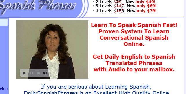
Pictures of Yourself
A picture of yourself is always a good idea. It shows people that they are dealing with a real person, and it conveys warmth and familiarity. Just try not to use a photograph that looks like a mugshot:
 And if you really are a professor, then your banner image should make you look like a professor, and not the world’s most bored telemarketer:
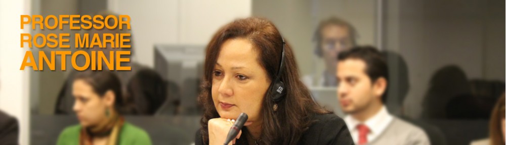 If you are going to include the picture on the front page of your website (as above), it is really worth the extra money to hire a professional photographer. At least then your website won’t end up as an example of what not to do.
Conclusion
Like I said earlier, a lot of this advice is about putting your readers and their needs first when designing your site. That doesn’t mean that you can’t have fun with your website, but it does mean that you will have to include some things that you possibly hadn’t thought of and eliminate (or isolate) certain elements that you wanted to emphasize.
You don’t have to take my word for it, however. You can always visit the World’s Worst Website.
https://techblog.kjodle.net/2012/01/13/guidelines-for-good-website-design/

Another tip: Don’t use too many tags in your articles unless you’re about to use them in your upcoming posts. A tag with only one post is completely useless. (Seriously, tags are so powerful that, it can make you rank high on Google or can even make you being kicked off by the God of the internet” for duplicate content!)
By the way, what do you think about my website? It has got a new look on front page!
– Prasanna SP
I’m glad to be one of the visitants on this outstanding internet web site (:, regards for posting .
Hi Kenneth: I enjoyed this post. I must say I agree about a lot of the useless stuff I see on websites.
I did learn a few things, too. I didn’t realize that text should be left ragged on the right side, but it does make sense.
I didn’t know you could set pages up to print without all the extra ink-wasting graphics.
I didn’t know about the 404 information. I think that’s for when you change a page. I’ve come across them lots of times when the owner hadn’t left the information, as you have.
I’ve bookmarked your blog as I’m sure I’ll want to return for more information. I like your dry humor style of writing, too. 🙂
Rhonda
fantastic points altogether, you just gained a new reader.
What could you recommend about your put up that you made a few days ago?
Any sure?
Ken’s note:
This comment is spam. I’ve deleted their web address from this comment, but their email address is kathleen_ellwood@gmx.net
Spammers and bots, have fun!
(BTW, don’t ever use TLC Plastering Specialists!)